Living & storage
Coordinate a wall plane with storage fronts and ceiling lines. KAIJIE coordinates these elements through a shared finish language.
APPLICATIONS / RESIDENTIAL
A calm material palette can connect everyday spaces. Consider proportion, touch, transitions and the way an interior will be maintained.
01 / ARRIVAL
Balance a strong stone-pattern plane with timber tones, storage and soft light.
02 / LIVING SPACES
Consider the feature wall with seating, openings and the distance from which it is seen. Texture can be expressive without overwhelming everyday life.
FROM DIRECTION TO DETAIL
Coordinate a wall plane with storage fronts and ceiling lines. KAIJIE coordinates these elements through a shared finish language.
Compare samples in the intended lighting. Discuss exposed edges, corners and junctions before finalising the room palette.
The experience hall shows how repeated fluted details and plain surfaces can sit together without overwhelming the room.
MATERIAL / KNOWLEDGE
Showroom interiors illustrate surface coordination, proportions and junctions. These are application references, not customer project case studies.
The living setting combines a broad light-coloured wall with a narrow vertical stone-appearance strip, dark shelving and a continuous lower edge. The relevant design comparison is proportion and junction alignment, not an assumed material formula.
The second view brings a framed stone-appearance inset next to a broad pale field and a curved column-like surface. Treat the curved detail as a design reference: this photograph does not provide a bend radius or confirm that any catalogue panel can form it.
Identify the dominant field, accent area and junction first. Then compare named finishes, board dimensions and approved details separately.
COMPARE NAMED SAMPLES →Request the actual product and fabrication detail for the curved area; do not carry over flat-wall installation rules.
INSPECT EDGES & PROFILES →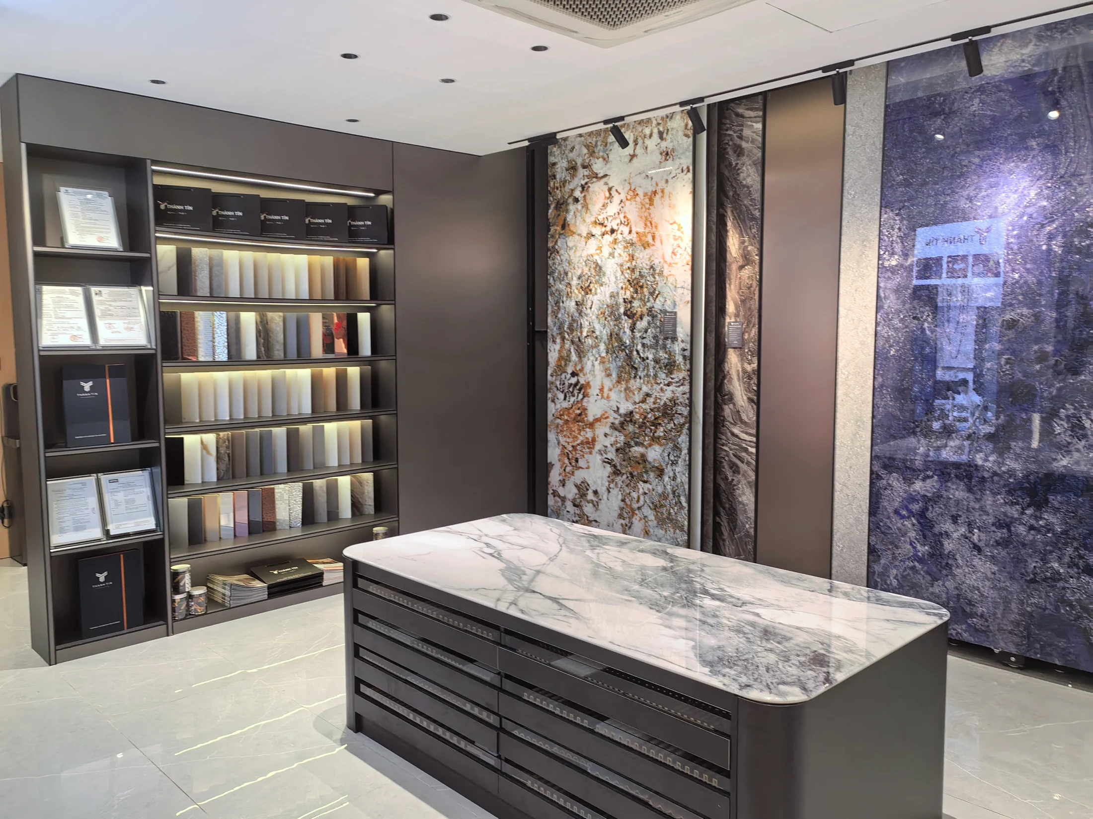
YOUR NEXT CHAPTER
Tell us about your market, your business,
and the material system you want to build.